05 HOSPITALITY · FRANCE
Cap Marine
Visual Direction · Content · Social Media
THE PROJECT
From restaurant
to destination.
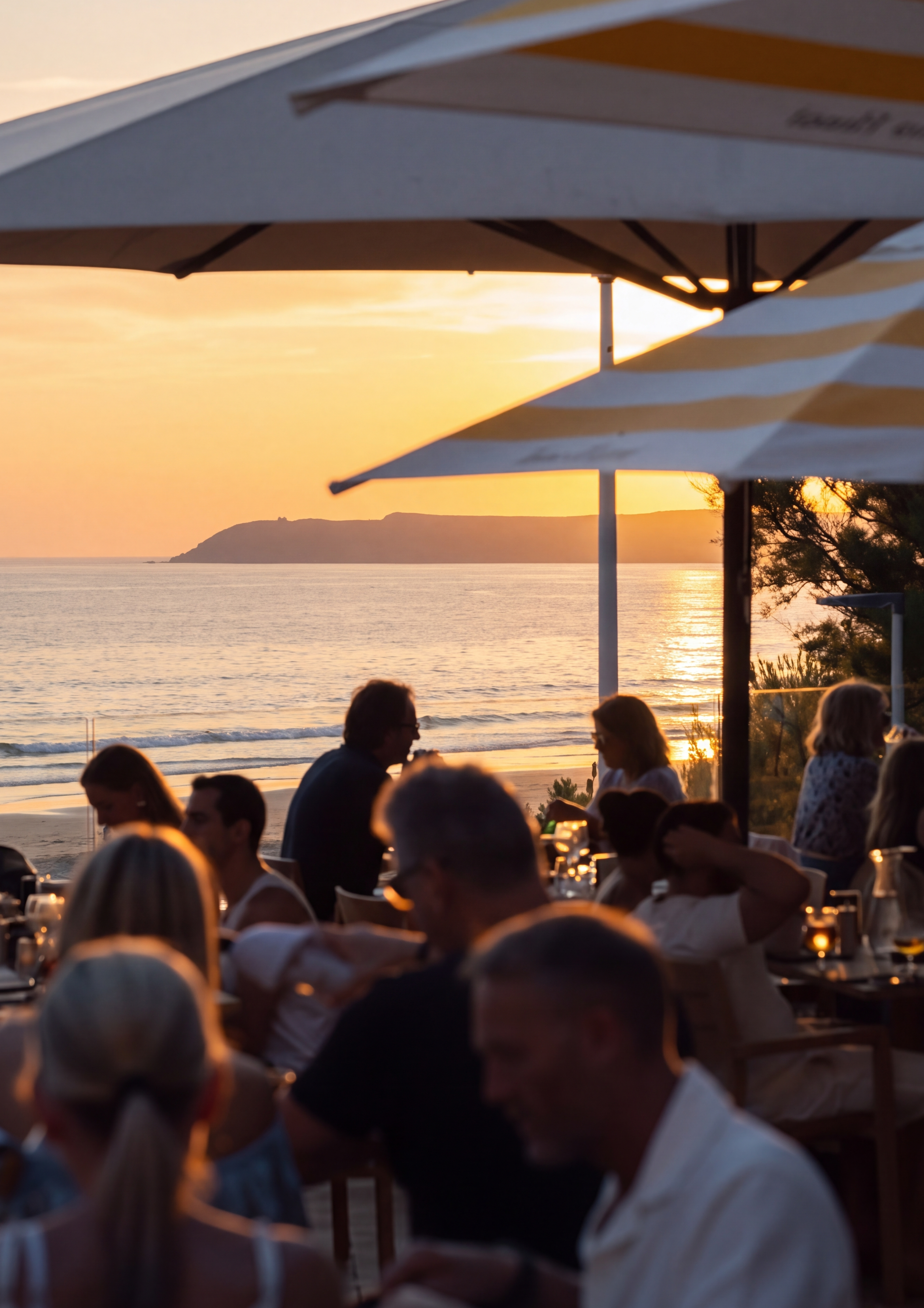
Cap Marine sits directly on the coast of Normandy, with the ocean, the terrace and the changing light already shaping the experience.
The opportunity was not to invent a new story, but to give the existing one a clearer visual structure. To move the communication beyond the restaurant itself, and make the place part of the reason to come.
THE DIRECTION
An identity
of its own
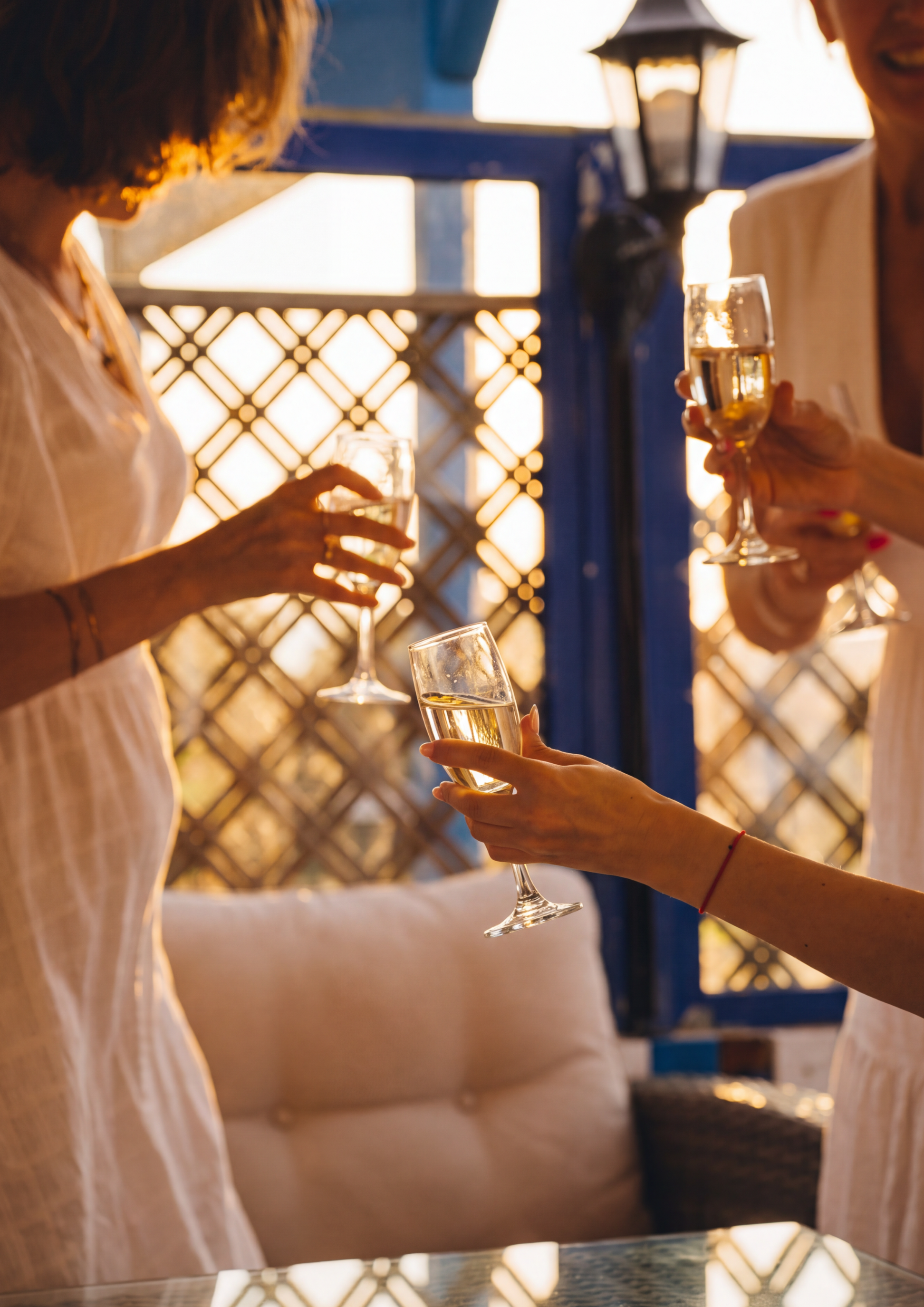
Rather than imposing a visual language onto Cap Marine, the direction began with what was already specific to it: its location, its atmosphere and its relationship with the sea.
The logo established the first point of recognition. Photography, typography, colour and content then extended that identity into a broader system, one capable of expressing both the restaurant and the experience around it.
THE VISUAL WORLD
Le goût
du large.
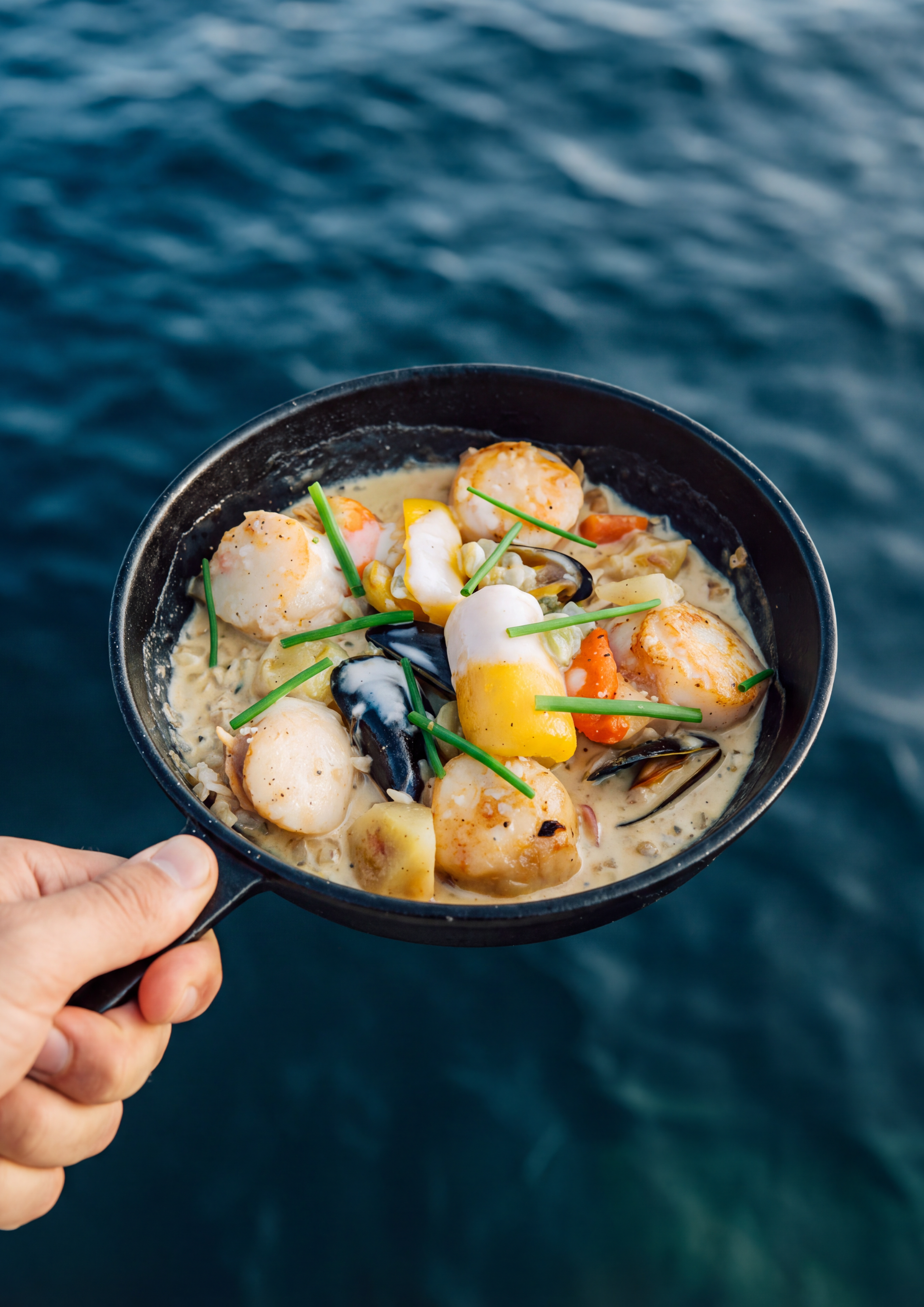
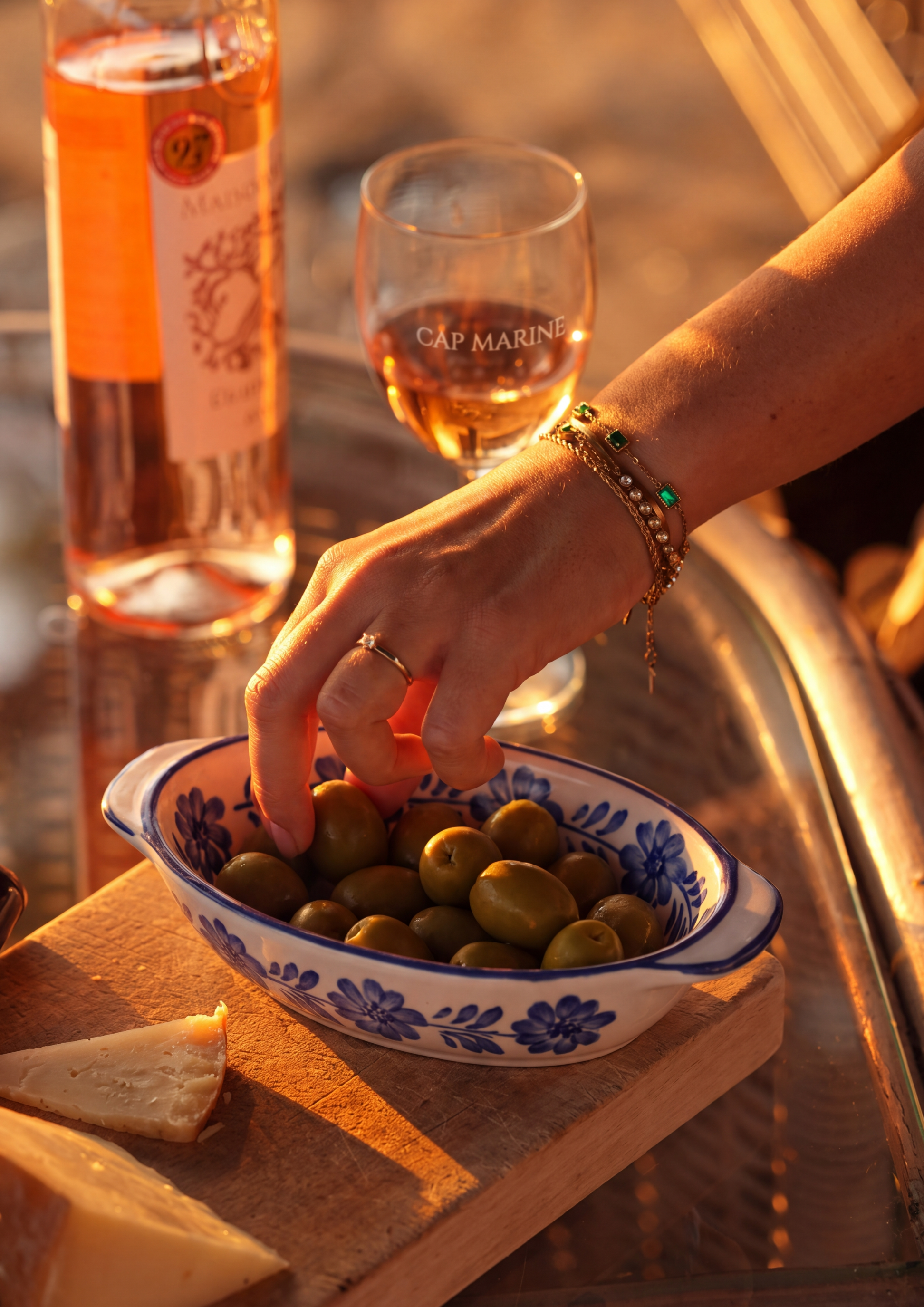
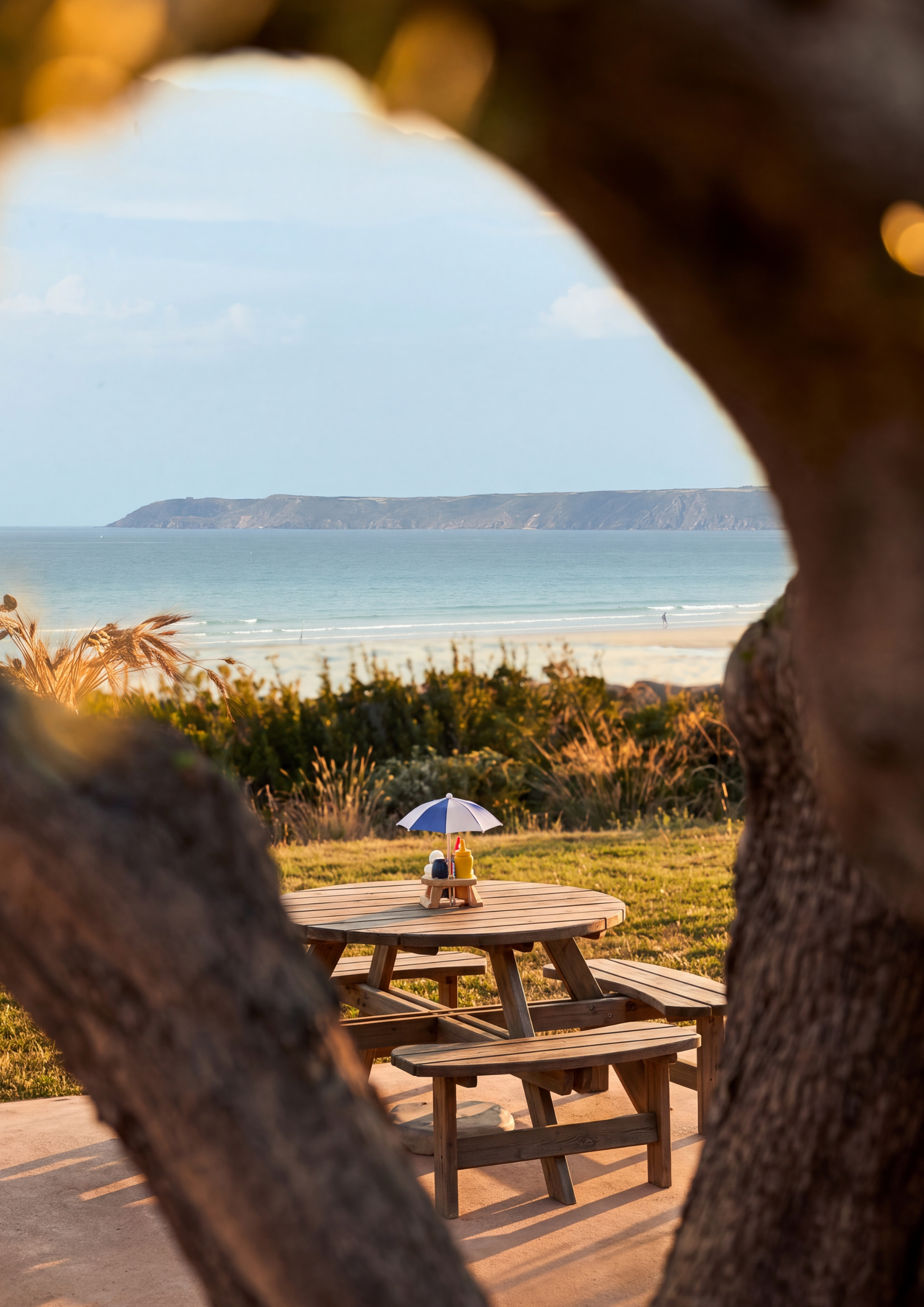
Landscape, cuisine and everyday gestures sit side by side. Natural light and the surrounding coast give the imagery its rhythm, while food remains part of a wider sense of place.
What We Did
-
Logo · Image language · Visual system
-
Grid direction · Editorial planning · Social formats
-
Photography · Hospitality imagery · Lifestyle content
THE OUTCOME
The Cotentin, seen differently.
A visual direction developed around Cap Marine as both restaurant and destination. Designed to extend naturally across social content, Reels and Stories, as well as menus, printed materials, signage and table objects.
HAVE A PROJECT IN MIND?
Let’s give it
direction.
A new identity, a new chapter, or a brand that needs clearer direction.