07 BEAUTY · FRANCE
Libert Nail Bar
Brand Identity · Creative Direction · Content · Social Media
THE PROJECT
Building a beauty brand around the experience.
Libert Nail Bar began as an independent beauty business with the opportunity to create a more defined presence from the ground up.
Maison Gia developed the brand across identity, visual direction and communication, creating a system designed to feel consistent from the first interaction to the physical experience of the space.
THE DIRECTION
Make the experience recognisable.
The identity was built around a clear point of view: polished, feminine and contemporary, without relying on the visual conventions of the traditional nail salon.
Colour, typography, imagery and tone were developed as one system. The objective was not simply to distinguish LNB visually, but to give the business a language it could own and use as a base in the future.
THE VISUAL WORLD
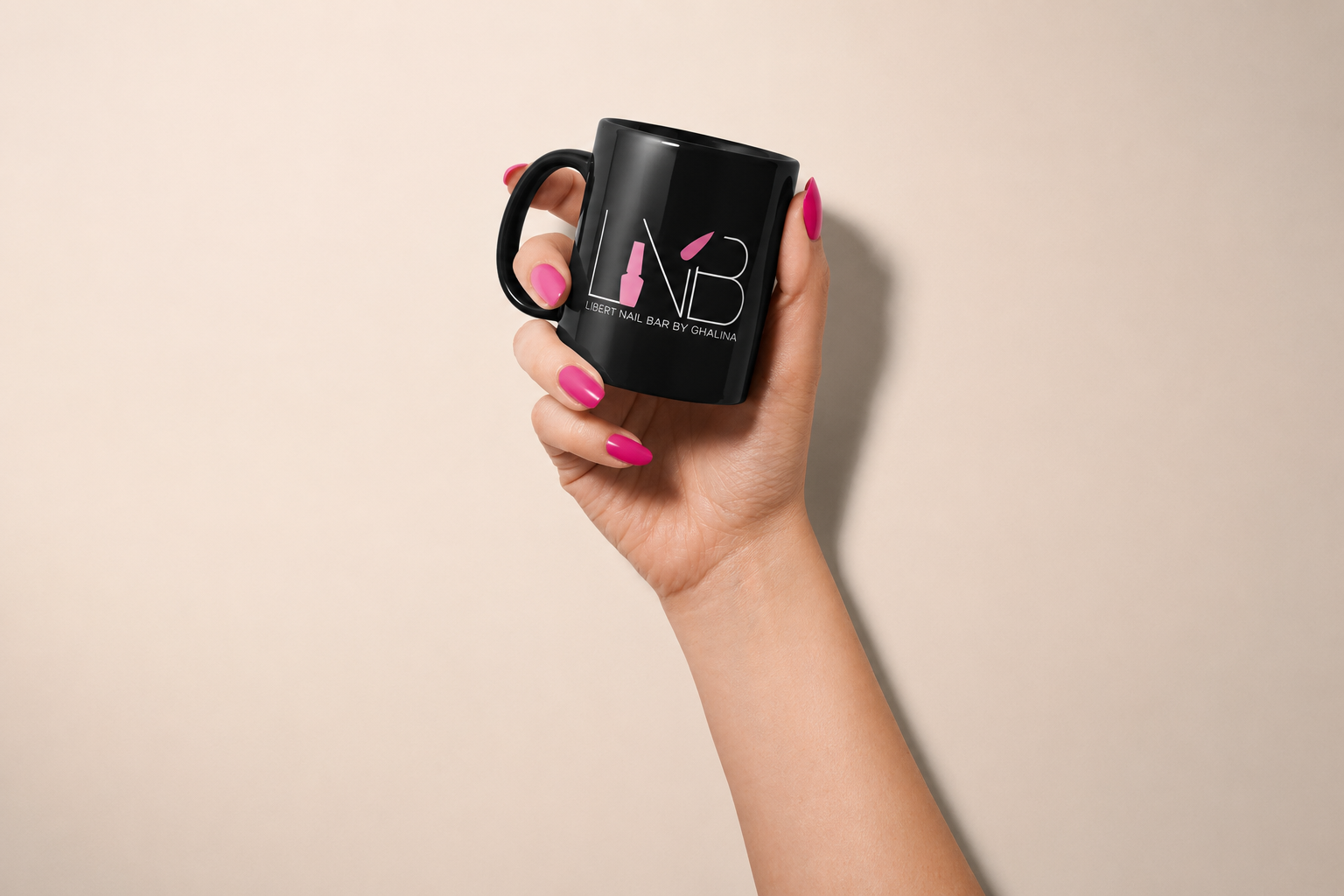
COLOUR · DETAIL · TEXTURE · GESTURE
The visual direction moves between the finished result and the experience around it.
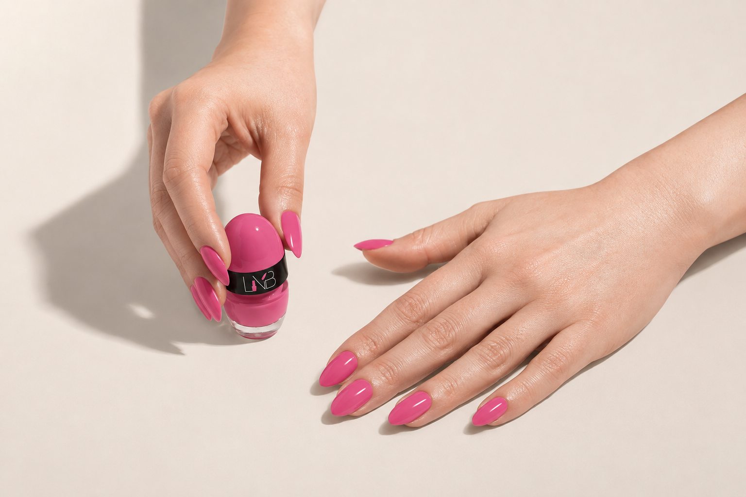
Hands, materials, product, colour and close detail create a beauty language that feels considered without becoming overly styled.
The result is a system flexible enough for seasonal variation while remaining immediately recognisable.

What We Did
-
Visual identity · Typography · Colour · Brand applications
-
Art direction · Image language · Printed and physical touchpoints
-
Photography · Content direction · Editorial planning · Social media · Seasonal campaigns
THE OUTCOME
From appointment to brand experience.
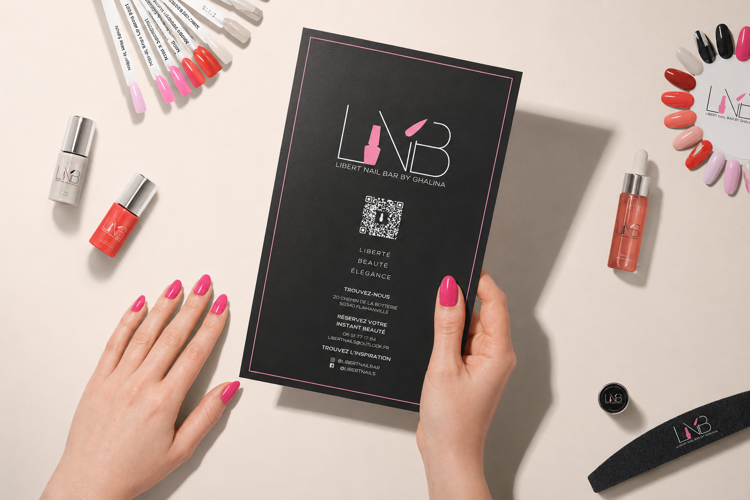
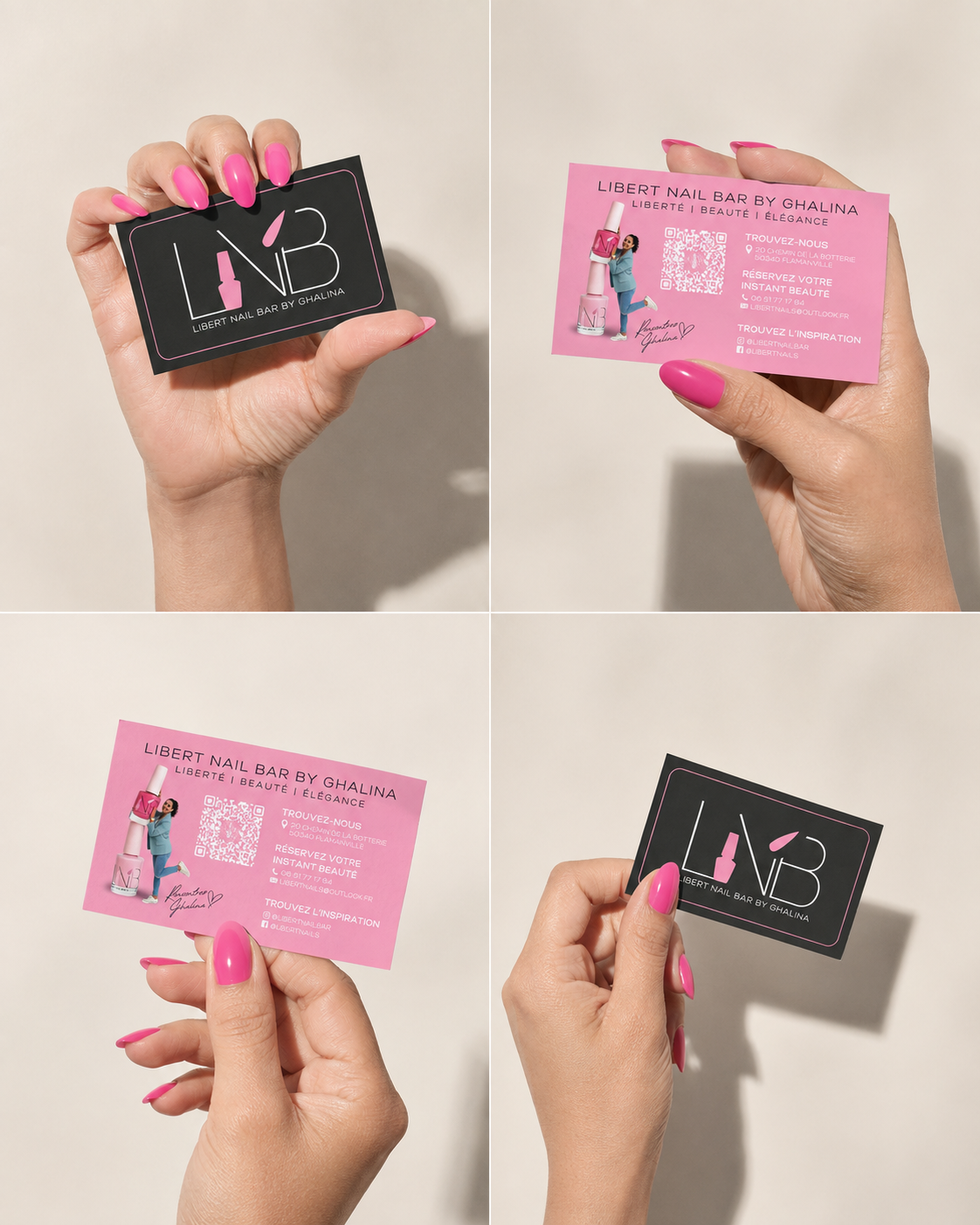
The identity was extended across digital and physical touchpoints, from social content and communications to printed material, packaging and details within the client experience. One visual language, carried through every point of contact.
HAVE A PROJECT IN MIND?
Let’s give it
direction.
A new identity, a new chapter, or a brand that needs clearer direction.